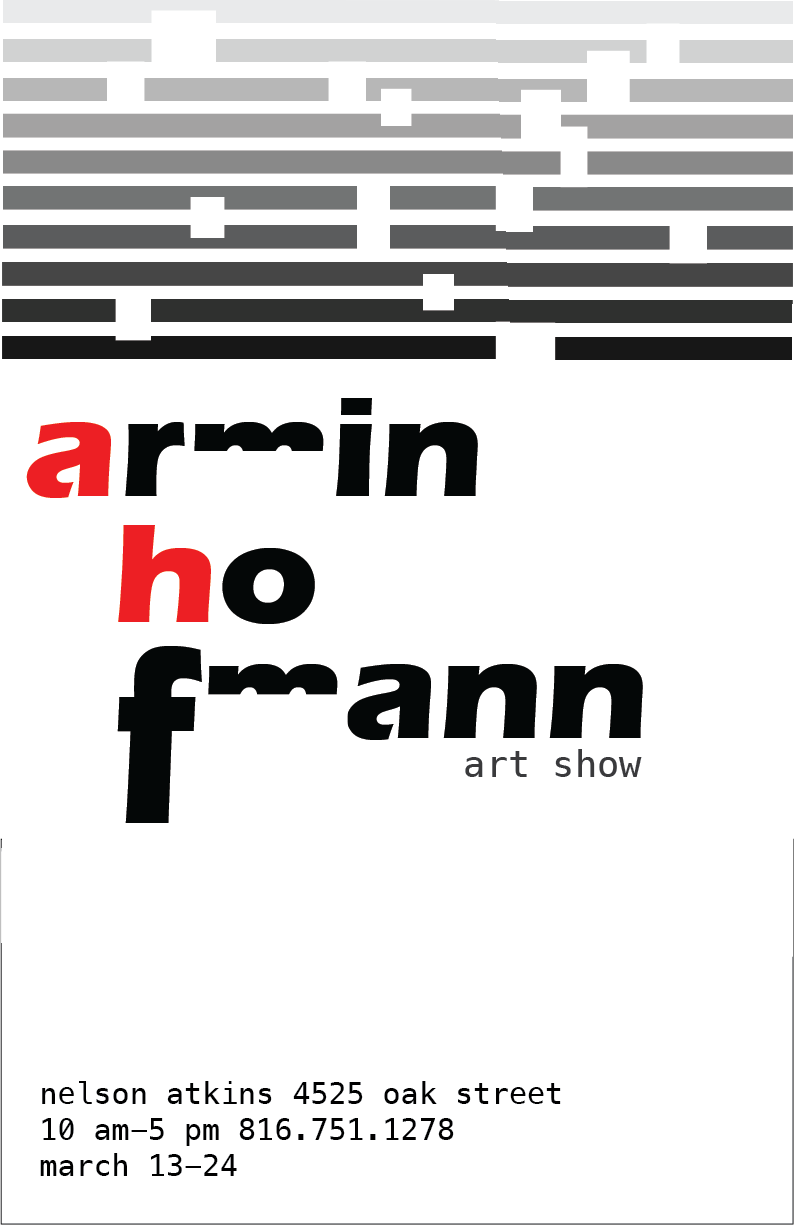
11x17 Poster
This is a poster I created to advertise an imaginary art show about Armin Hofmann. Hofmann is a graphic designer that I have been researching since early December. I picked him because his art spoke to me and I loved his use of black and white with little dashes of bright primary colors; especially red, as seen in his "Graphic Design Manuel". I researched his early life, his college experience, how he got into the arts, and his big impact on students everywhere. He was very influential to his students and in a book that he wrote, "Graphic Design Manuel", he talked about different ways to make posters appealing. For this project I first created 20 rough sketches in my sketch book so I could gather my ideas and be organized. Than I chose some of my favorites and tried to recreate them in Adobe Illustrator. I ended up with this as my final project where I incorporated some of his main colors, black, white, grey, and red. Some challenges were trying to make this all look visually appealing with all the information I needed to include. I was given good feedback like I changed the M's to make them more identifiable so people knew that this was a show for Armin Hofmann. Overall I'm happy with this poster and excited to learn more about one of my now favorite designers.

Typography 5x5 Artboards
I chose my quotes by thinking about myself and my values. They talk about dance and tea which I love. The others talk about going from an amateur to an artist. This project took about a month from the beginning sketches to these final products. All these quotes are near and dear to my heart which is why I chose them. At first they were in black and white and then when I added color they came to life. I used various color schemes like complementary and triads and shades. My personal favorite is shades because I like seeing how many varieties one color can have and I think they also look very good and structured well together. When I presented the art boards

to my class they gave me great feedback like tips on alignment and color choice that I really took to heart. Some other feedback I got was to make sure everything was centered and even. Those were some challenges I faced along the way but I was glad I got the critics I did. Overall I loved creating this project because I've always loved typography and was very happy to finally get to pursue it in Exploring Graphic Design in depth. It was interested to dive even deeper into the typography world and learn it's rules and regulations to make it even better than it was before. We watched a lot of videos over typography and how to use it and make it look visually appealing. They really helped me understand typefaces and the do's and don't's.
My favorite one of my typography art boards was probably this once. I felt it really spot to who I am on the inside and dancing career to remember that you can't be god at everything but you are definitely special at something.
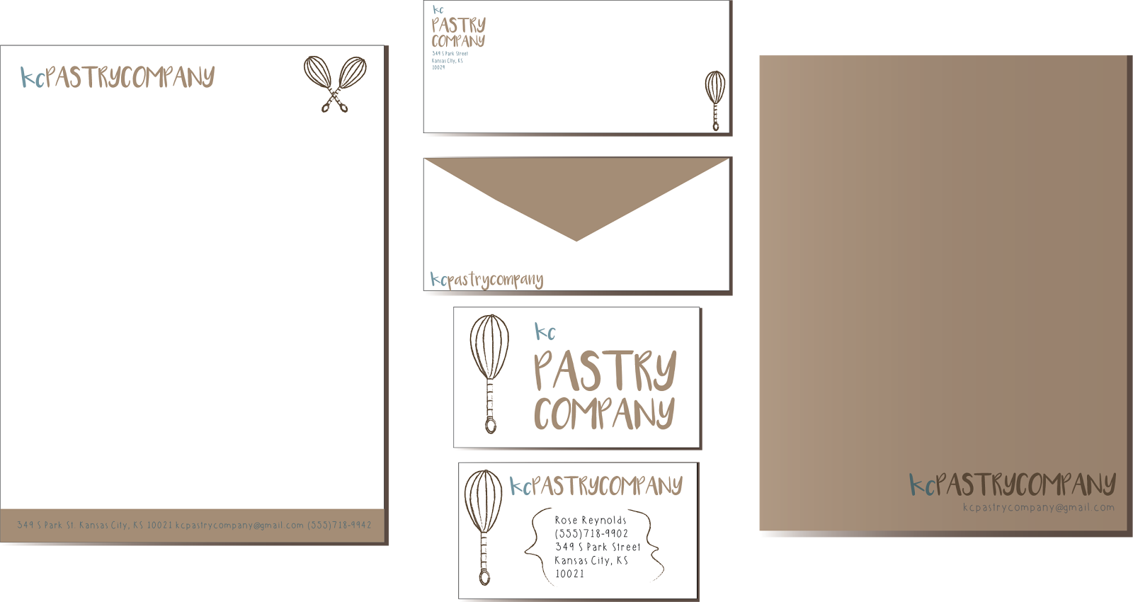
Combination Mark Logo
 |
| Our next project was to rebrand a company in Kansas City that needed a logo adjustment. I chose the KC Pastry Company in downtown KC. I first sketched a lot of sketches and found 6 that I liked than took those and did specific color schemes and I chose my final favorite with the color scheme complimentary shown above. Than we actually rebranding on an Envelope, Business Card, and a Letterhead. I really like my combination mark, I am glad I chose something simple but easily recognizable. My actual combination mark logo is broken up in the branding shown above. It is 'kc' written in a sky blue and 'Pastry Company' in a faded brown. The darker brown whisk next to these words really show that this is a pastry. They only sell donuts so when I originally made my 30 sketches I tried to only incorporate donuts and no other pastries. I ended up with no donut because I thought the whisk was enough. I incorporated the logo in some way shape or form in all three brandings I did. My favorite part about this project was redoing a logo from scratch and putting my own personal flare to the rebranding. My least favorite part was probably just picking one in the end because I loved all of my combination marks and felt they were all really strong. This project took about a month since we started sketching first before actually ouching the computer. I liked that because it helped me keep my thoughts in order. |

Letterhead
In the Letterhead I tried to use a lot of the brown color and on the back I turned the opacity dow to give it a faded look. On the front I wanted it to be minimal enough where you had a lot of room to type but still recognizable. I put all the important information on the bottom and morphed the original combination mark on the top to make the weight of the front, top to bottom ratio, equal.
Envelope
I used the whisk again in the Envelope to give it a uniform look. I made sure to leave room formal the information and stamp the user would add. I made the back flap a toned down town color that I have used in this project a lot. Again, my original combination mark is prominent but in a newfound way than the very first one.
Business Card
I used homemade looking brackets in my Business Card to give the sense of home cooking and baking. The overall look is homemade and not 'strict'. I didn't add a background color I left it white because I didn't want to make it overcrowded since it has a simplistic theme in all three creations.
Time Management
In class I try to maximize my time as much as possible. If, for some reason, I get finished early, I immediately try to find a way to try and improve my project in some way before I turn it in. I double check everything so that there are no mistakes and once I am sure I've done all I can do for the project and it is the best I can make it, thats when I turn it in. Being in e-Comm in general has really improved my time management. I get all my work done by the deadline because I actually do it in the time that Mrs. Smith gives us. Sometimes, if I feel like I need more time to get my project to the best it can be I stay after school to work on it. I don't just rush and turn it in during class when I know I need more time to get it to its full potential, I come back after school or before school with a fresh mind and work on it until its to my liking. If I end up with an extra couple of minutes or so in class I try to take that time and use it to the fullest to make my project the best it can be.
Strengths and Weaknesses
Some areas of my strengths are time management. As I mentioned before, e-Comm has really helped improve my time management not only for graphic design but for all of my classes. Another strength of mine are my technical skills. I can follow a tutorial with little to no help. I understand the editing softwares and help many classmates if they get stuck. One area that I can improve on is my creativity. I love following step by step tutorials but have a hard time making it my own. I struggle when I am given a project with no instructions and have a hard time. I know that I have improved on this since last semester and know I will improve on this more throughout the years, I just need more practice, and more projects that allow me to be free in my editing.
Overview
What I loved most about this semester was the typography quotes project because I felt like I really got to know myself and find quotes that truly show who I am and I actually felt pretty good about making the art boards without a tutorial. There isn't anything that I would really want to change about this semester in graphic design, I had a very positive experience in this class. One overall take-away form this semester is don't second guess yourself. If you like your work but someone else thinks you should change something that you don't really want to change, don't change it. Go with your gut. But on the opposite side of that make sure you listen to your peers' critics for you because you are all on the same level and critics are always good when it its constructive. One goal I want to set for junior year is to organize my thoughts more by sketching. I used to hate sketching and just want to jump on the computer and start creating before actually thinking through what I want to create. This semester has opened my eyes more and shown me that sketching your thoughts is necessary to make a spectacular final product.