 to problem solve, and that the Internet does have the answers. I have gained a lot of insight this semester and I am excited to start next year!
Thursday, December 17, 2015
DreamWeaver
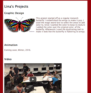
These are some pictures from Website made from Dreamweaver. I included my elevator pitch, bio, and some of my favorite projects. There is a link at the bottom of the projects page that takes you to the home page and vice versa. This was our final project in Graphic Design. I have learned a lot this semester in e-Communication. Graphic design particularly has taught me
 to problem solve, and that the Internet does have the answers. I have gained a lot of insight this semester and I am excited to start next year!
 to problem solve, and that the Internet does have the answers. I have gained a lot of insight this semester and I am excited to start next year!
Tuesday, December 8, 2015
Yin Yang Tutorial in Adobe Illustrator
STEP 1: First open up Illustrator and open a new page. Click on the Ellipse tool to start this tutorial.
STEP 2: Using the Ellipse tool draw a circle while holding down the 'shift' button so it is an even circle.
STEP 3: Using the Ellipse tool again draw two smaller circles that are the same size (use the 'shift button') and make sure they can fit into our big circle.
STEP 4: Then start moving the two smaller circles right on top of each other. Keep adjusting their sizes until they are equal and in the center of the first circle.
STEP 5: Next using the ellipse tool one more time make two very small circles to go in the center of our last two circles. These circles should be around 0.3mm and the same size.
STEP 6: Next go up to the tool bar and click Object. And select the entire project.
STEP 7: And then click Expand. When the Expand window opens, just leave it how it is and click OK.
STEP 8: Then, go to the left sidebar and click the Shape Builder Tool.
STEP 9: Now you can click in any section of the symbol. But now what you need to do it click on the farthest left section like shown and hold it and drag to the top circle.
STEP 10: Now it should look like this and now repeat on the right side.
STEP 11: Now it should look like mine.
STEP 12: Finally you can add any color to wherever it needs to go. This part is up to you but I stayed with the original Yin Yang look which is Black and White.
Wednesday, December 2, 2015
Colorful Butterfly
This project started off as a regular monarch butterfly. I embellished the wings to make it pop. I used the magic wand tool to select the areas to add color to. Since I wanted the color to keep its texture I added the color over the original color. of the butterfly. Then afterwards I used the duplicating tool to make it look like the butterfly is fluttering its wings.
This project was made with Adobe Photoshop.
This project was made with Adobe Photoshop.
Olathe Northwest High School
   |
This project was made with Adobe Photoshop.
Wednesday, November 11, 2015
Personal Logo
Monday, November 9, 2015
My Personality Type


WHO ARE YOU?
Anatomy of a Font
The font used is SimSun Ext. B Regular. It describes me because it is quirky but yet refined as well. The 'ears' on the a's and the 'serifs' on the l's, i's, and n's etc. show its quirkiness.
In font anatomy there are 5 main lines: ascender, cap height, z height, baseline, and descender. In my name there are no letter that so above or below the ascender or descender lines. But using this font, it gives my name a lot of serifs on the letters.
In font anatomy there are 5 main lines: ascender, cap height, z height, baseline, and descender. In my name there are no letter that so above or below the ascender or descender lines. But using this font, it gives my name a lot of serifs on the letters.
Tuesday, October 27, 2015
Creative Color Wheel
Color wheels can be either very simple or very complex. It all depends on the artist creating it. But one thing that all color wheels have in common is color. They have 3 primary colors; red, yellow and blue. This color wheel that I have creating is considered out of the ordinary because it doesn't look like your average wheel. You may hear some people say that some color is associated with emotion. They are right! Blue most people think of loyalty, or comfort but sometimes also sadness or depression. Red might associate with fire, or anger of war. The color wheel plays a huge role in your everyday life.
Adobe Illustrator was used in the creation of this wheel.
Tuesday, October 20, 2015
What Is Graphic Design?
Graphic design is the art of combining text and pictures in advertisements, magazines, or books. It is used to communicate a message to the consumer. A graphic designer has to speak for the people in their work. We use graphic design to cross the street, get married, pay bills, decide what to eat and much more. Graphic design artists who make covers of books have to make them very interesting. They use different fonts and colors to convey their message and to grab the consumers attention. The designers always say to do what you think is smart and interesting and then afterwards think of the surveys. The artists also have to think like to buyer. Without graphic design, our world would be a dull place to live.
Below is a link to the Universal Arts of Graphic Design.
 |
| This is the logo of the Kansas City Ballet. It has interesting typography. |
https://www.youtube.com/watch?v=sTi5SNgxE3U
Tuesday, October 13, 2015
"They Loved Your GPA, Then They Saw Your Tweets"
GPA scores are not the only thing colleges look for when they search through applicants. They look through any and all of your social media posts because if you are not the person you say you are in your application then the college will not take you based on your twitter updates and Instagram photos. What surprised me was that 30% of the admissions officers said that they had discovered information online that had negatively affected an applicants prospects. And that some students try so hard not to get caught online with their photos that they have two Facebook accounts. I wonder why they post photos that they know colleges wouldn't like. After reading this article I hope some students will think about what they post before they post.
Monday, October 5, 2015
Chase Scene
This project is called "Chase Scene". Our goal was to record a chase scene with the actors in our e-Comm class. We captured moving shots without moving the camera. First we planned what we were going to film. We made a storyboard and drew pictures about the different shots we will be using. Then we started to film, while following our storyboard. After we filmed all the shots we wanted we went into editing mode. We edited on Final Cut Pro. I learned a lot throughout this experience. learned a great deal about time management. I learned everything about editing on Final Cut Pro. Next time I would get a lot more shots than necessary to make sure I have more than enough. What I would do the same would be that I would also listen to the ideas of others. Some experiences I would draw from this would be to never underestimate how much time we have to film. Overall the "Chase Scene" was a fun and challenging experience.
Wednesday, September 16, 2015
Friday, August 28, 2015
Printing Project
This is a video that we made called "Printing Project"
Thursday, August 20, 2015
Six Shot System
Six- Shot System
By Lina Sattarin
This is the six- shot system. It is used to get a variety of shots using one model and/or one area.

This is a close-up of the face. This shot shows the emotion of the subject. For a photo to be considered a close-up of the face, it has to show someone's face from chin to forehead.
This is a close-up of the hands. This shot shows the action of the shot. In this shot it shows the subject's hands are writing or studying.
This is an over the shoulder shot (OTS). This shows what the subject is looking at; their point of view. To take this shot remember the rule of thirds, and put the subjects head on one rule of third line and what they are looking at on another.
This is a medium shot. It captures a general perspective of what the subject is doing. To be considered a medium shot it has to be of the subject from the waist up.

This is a wide shot. This shows the subject's physical characteristics. To be a wide shot it has to be of the subject from head to toe.
This is an extra-wide shot. It shows everything around the subject. It gives you a great perspective on what is around the subject.
Subscribe to:
Comments (Atom)


